| Carmix - Your Personal Concrete Mixer Truck Posted: 29 Jan 2010 07:58 PM PST 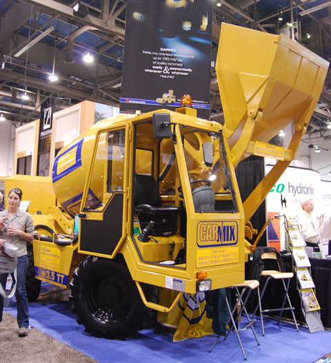
Out of all the work trucks we saw at the 2010 Builders' Show the Carmix One was the coolest. It's a self-loading concrete mixer that's perfect for when you need a lot more concrete than a wheel barrow can provide and you need it in multiple spots quickly. It's also small enough to be more nimble and manageable than a full-size mixer truck which is overkill for most projects. 

![]() |
| Solving Chandelier Access Problems with an Aladdin Light Lift Posted: 29 Jan 2010 01:44 PM PST 
Don't we all have a problem with trying to dust our chandeliers? Ok, maybe not all of us. But for those that do chandeliers are a mecca for cobwebs and dust. They are just too high and too delicate to reach. Of course at the 2010 Builders' Show there was a manufacturer that specializes in light lifts which are perfect for cleaning large ornamental lights as well as gaining access to change bulbs. The Aladdin Light Lift is installed using a system of pulleys and cables that is controlled from a remote switch on your wall that allows you to lower and lift the light as needed. 

![]() |
| Hot Edge Prevents Icicles and Ice Dams Posted: 29 Jan 2010 12:45 PM PST 
Falling icicles can be dangerous to you and heavy ice dams can be a detriment to your home. We came across the HOT EDGE at the 2010 Builders' Show which looks like a great solution. It lines your existing gutter and melts ice and snow away from the edge of your roofline which is the most troublesome area. It doesn't waste energy heating your entire roof as that part of the structure can handle the weight, unlike your gutters and roof edge. 

![]() |
| Wine Storage Wow! Posted: 29 Jan 2010 11:50 AM PST 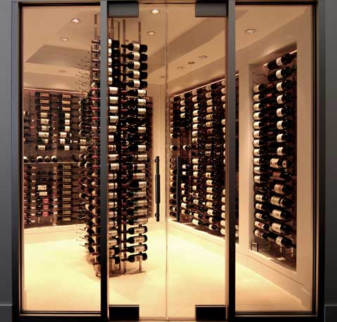
There was plenty of luxury on display at the 2010 Builders' Show and it is no more apparent than in the wine storage sector. VintageView from the Wine Master Cellars is a wine-lovers dream. They were the first wine storage company to create a label-forward wine racking display system instead of the traditional cork forward display. Now you can really show off your vintage without pulling bottles. These systems are in place in the finest restaurants and hotels throughout the world but you can also have one of these installed at home. Hey it's just money! 

![]() |
| Water Heaters Have Gone Hybrid Posted: 29 Jan 2010 11:33 AM PST 
Tankless water heaters have been the rage for sometime but if you still crave a more traditional water heater but want the energy savings then you may want to consider the Hybrid Water Heater from GE which we saw at the 2010 Builders Show.
It's the first water heater to be to be listed on the U.S. Department of Energy's website as Energy Star rated. GE claims it will reduce energy expenses up to 62%, saving as much as $320 annually on energy bills. This is achieved through a unique technology in addition to electric power explained below. 

![]() |
| Beautiful Entertainment Centers for Large Screen Televisions Posted: 29 Jan 2010 11:24 AM PST  Did you just purchase that huge 72" plasma television? Does it now take up your one entire free wall and leave you no room for placement of other items? Check out the newly styled entertainment centers made specifically for housing today's larger televisions and provide compartments and storage areas for other items such as stereo or gaming components. Did you just purchase that huge 72" plasma television? Does it now take up your one entire free wall and leave you no room for placement of other items? Check out the newly styled entertainment centers made specifically for housing today's larger televisions and provide compartments and storage areas for other items such as stereo or gaming components.
Media Cabinets and Entertainment Centers Come In Many Styles These entertainment and media cabinets come in beautiful materials and lend themselves wonderfully to any style. Some units offer a hidden compartment for your television which keeps the unit from view when not in use. Lifting Mechanisms Add Even More Functionality When you are ready to watch your new television, a touch of a button turns on a lifting mechanism which raises the television from its lower compartment. This feature allows your TV to be neatly hidden away when not in use. Newly styled entertainment centers can hold all of your media and entertainment components and also be a beautiful furniture addition to your living room or den. DirectBuy offers a wide selection of home entertainment equipment and media centers to help you make your home both functional and stylish with brand-name furniture from leading manufacturers. |
| Unexpected Color Combos for the Kitchen Posted: 29 Jan 2010 09:12 AM PST I came across some beautiful, yet unexpected color combos on HGTV. It's amazing! I never would have considered these colors before. Here are a few of my favorites. Green & Silver 
We've seen green and pink, green and brown, green and blue… but this flat, muted shade with shiny silver creates real elegance and has a calming effect. Punch up the energy with darker shades of green in everything from lime to kelly. Red & White 
Nothing says bold like one or more red walls, even more so when contrasted with bright white cabinetry. Here, the lighting softens the look to make it striking, not shocking. Black & Blue 
In shades from slate to periwinkle, blue is an unusual choice to pair with black in a kitchen, but a creative one nevertheless. As opposed to natural-tone cabinetry, it really creates "a look." This kitchen has style yet maintains its warmth. Black & White 
While black and white may not be an unusual pairing, outside of retro-style kitchens, it's usually seen with a ton of another color. But with shiny surfaces and accoutrements, such as stainless steel, glass vessels and lots of natural lighting, it creates a surprisingly soft and approachable feel. Photo Credit: HGTV Please bookmark and share |
| Choosing a Vessel Sink Design For Your Bathroom Posted: 29 Jan 2010 02:00 AM PST 
Vessel sinks are the hottest new trend in bathroom design. In many ways, vessel sinks are a throwback to a time before plumbing when people washed up each morning in elaborate china basins that sat atop their bedroom vanities. During Victorian times these beautiful China fixtures were paired with matching floral and gilt pitchers to hold the water, and some people still collect these sets. Vessel sinks are a beautiful new take on an old idea. Today's vessel sinks offer many more choices than their Victorian counterparts. Copper vessel sinks enhance Arts & Crafts Revival decor in bungalows and foursquare homes. Ceramic and pottery vessel sinks make charming accents for modern country bathrooms.
To choose the perfect vessel sink for your decorating style, start by matching material to design. Some of the most popular vessel sink materials include: Copper - Copper has always been popular in kitchens, but with the resurgence in popularity of sleek Arts & Crafts cabinetry and fixtures, copper vessel sinks are coming back in a big way. Look for hammered antique finishes, verdigris effects, or smooth glossy copper surfaces. Copper does dent easily but also has the advantage of being a natural germ repellent. Glass - Glass is the most popular of all materials used for vessel sinks. A glass vessel sink can be purchased for as little as $100, all the way up to thousands of dollars for specialty or hand blown glass. Glass comes in a range of colors and effects, but do keep in mind it must be cleaned with each use. Stainless Steel - Stainless steel vessel sinks look great with industrial or ultramodern decor, or next to a stainless stove or wet bar with stainless accessories. Stainless steel can be noisy though, and it does show water spots. Look for heavy gauge stainless to help keep noise to a minimum. 

![]() |
| Rug and Slipper Combo Posted: 29 Jan 2010 01:51 AM PST 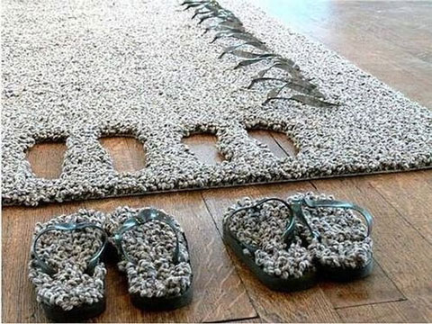
Who knew it would work out so well...or not. [via Gizmodo] 

![]() |
| Follow Us on Twitter and Facebook Posted: 29 Jan 2010 12:43 AM PST  The conversation right now is on Twitter. If you love home improvement and DIY you'll find many great writers, bloggers, magazines, company reps and a few remodeling celebs (@BobVila) on Twitter. The conversation right now is on Twitter. If you love home improvement and DIY you'll find many great writers, bloggers, magazines, company reps and a few remodeling celebs (@BobVila) on Twitter.
Make sure you follow us @Charles_Hudson as we tweet from events, industry tradeshows and often break giveaways and share home building news throughout the day. We are also building our Facebook community at facebook.com/charlesandhudson. We post our most popular articles and share other websites that we love. Join us on Facebook
Follow us on Twitter 

![]() |
| Scribbly Cool Coat Rack Posted: 28 Jan 2010 01:27 PM PST 
Hanging your coat is fun again. Well, perhaps it never was. But now that it incorporates coloring, maybe you'll be less apt to sling your slicker over the back of a chair. 
The steel and elastic coat hanger line by Slastic comes with five pencils in a rainbow of colors. Throw coats on the hangers, and the weight draws the pencils down the wall, leaving colorful scribbles in its wake. 
Designed by Ana Mir and Emili Padros for Moustache, the look can be made either fun and splashy or surprisingly sophisticated when combined with other artwork. 
Please bookmark and share |
| The Multifaceted Bolster Pillow Posted: 28 Jan 2010 12:25 PM PST  Bolster pillows really don't get enough credit. People are always talking about bed pillows and throw pillows but bolster pillows, not so much. Bolster pillows are wonderful accent accessories and can serve several purposes without losing their shape. Bolster pillows really don't get enough credit. People are always talking about bed pillows and throw pillows but bolster pillows, not so much. Bolster pillows are wonderful accent accessories and can serve several purposes without losing their shape.
Cylindrical Bolster Pillows Come in Varying Lengths and Girths They make wonderful safety pads when used as a bumper on the interior of baby cribs. Use them on the bed , floor , or sofa as a neck or knee support while you read or relax. You have hundreds of choices for fabric coverings, even waterproof material, which means you can even use bolster pillows outside while you're working on your tan. So you see, the bolster pillow really is multifaceted. Get one for every room in your home and a couple for outside too! Shopping at DirectBuy offers you a wide range of home accessories and furniture to make your home décor come to life. With the savings of up to 50% off retail on everything you purchase, you can turn your home into the place you've always wanted it to be. |
| Versatile & Comfy: 5 Alternative Seating Styles Posted: 28 Jan 2010 11:03 AM PST I like a living space that is versatile, comfortable and amenable to conversation. Here's a collection of landing places for your most convivial guests. 
#1 – Bi-Pod seats by Roche Bobois are clever, colorful, interconnecting blocks that can be tossed anywhere they're needed. A great alternative to the standard "conversation area" with permanently placed coffee table and two chairs. 
#2 – It doesn't get more organic-looking than these plush stones and pebbles in various sizes. From Viva Terra, they're draped in Merino wool and are hand-washable. 
#3 – Flexible Love by Skart contracts or expands to seat up to 16 guests. Made from recyclable paper and wood, you can change the length just by pulling the ends accordion-style! 
#4 – These hand-carved solid ebony Egg Stools from Bahay are an artful perch for those who love the look and feel of wood. 
#5 – These natural-look Reversible Side Tables from West Elm are sold as a set of two. Nest them together for one larger table or pull them apart to multi-task. 
Please bookmark and share |
| Baby, It's Cold Inside! - Going Heatless Posted: 28 Jan 2010 10:43 AM PST 
During the winter, a natural reaction is to turn up the heat--crank it, in some cases--to get warm air flooding through your home's interior. But thanks to a tip from this New York Times story, I've been introduced to an opposite species--those who prefer to live without heat (or a frigidly low thermostat setting) during the year's coldest months. Arguably the biggest advantage to keeping your home's temperature at 55 degrees and lower is a sizable energy savings, especially if you rely on a propane or gas-fueled heat source. Yet several of these homeowners are inspired to go without heat because of the expensive financial burden inflicted by making necessary structural or insulation repairs, especially to old homes and loft buildings. 

![]() |


 Did you just purchase that huge 72" plasma television? Does it now take up your one entire free wall and leave you no room for placement of other items? Check out the newly styled entertainment centers made specifically for housing today's larger televisions and provide compartments and storage areas for other items such as stereo or gaming components.


 Bolster pillows really don't get enough credit. People are always talking about bed pillows and throw pillows but bolster pillows, not so much. Bolster pillows are wonderful accent accessories and can serve several purposes without losing their shape.


